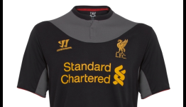
Following Warrior’s design direction of modern tradition - the new kit is inspired by Liverpool FC’s Away Kit from 1900-1906 which featured the yoke detail in recognition of sailors and the huge influence of the docks on the city at the time.
Said it once and I'll say it again, the logo would look much better if it was the only thing on the jersey that was gold. If the advertisement and warrior logo were white for example, the Liverpool logo would standout and look much more glamorous.


Warrior looks to be off to a good start. Looks sweet.
Looks good. They should take off the pic of Dirk Kuyt :( it's sad seeing him go.
Don't really like it.
Might look better on players though. Looks smart on Stevie.
I do like them thinking out of the box a bit, unlike Adidas and their sterile, uniformed approach.
I really like the design of the Kit, not a fan of the Color choice though.
Said it once and I'll say it again, the logo would look much better if it was the only thing on the jersey that was gold. If the advertisement and warrior logo were white for example, the Liverpool logo would standout and look much more glamorous.