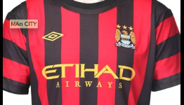
We are big fans of this new Man City effort, clearly looks like an AC Milan attempt but with horizontal stripes on the sleeves, which looks a tad odd, still a pretty nice shirt though.
So oooooooold City copied AC Milan with black and red many many years ago when they dominated football thinking it would bring them luck and it did in a way and became part of our history so year back in the past it was copying them but no longer it's part of our history now.
I don't even know what are you trying to say, let me guess you saying the shirt doesn't look like AC Milan shirt? Anyway they should at least do their home kit into Inter one as it blue too


looks pretty nice!
They want to copy AC Milan. The only thing it has to do with City is that it is really ugly!
Good looking shirt, however Tevez would still be as ugly as ever in it.
Different. Okay, but completely flops when combined with the logo.