Having spent the last 20 years labouring under the same branding, the MLS has regenerated today, with the entire organisation getting a head-to-toe makeover as it moves into its next phase – a phase which they are rather handily referring to as their “NEXT” phase.
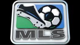
Of course, with a new re-brand comes a new logo and replacing the now-synonymous retro blue and green “cleat/ball” logo of yesterday comes a cool, crisp, exclusive, aspirational and dynamic symbol of MLS’s brave new dawn.
Without further ado, here is the aforementioned new NEXT logo – prepare to be slightly underwhelmed…


Thats the best they could come up with?